aj
.അജയ്
Company
HaiLABS
Role
Product Designer
Team
1Designer,5SDE,2QA
Data Adventures for Middle Schoolers
Time line
October 2023-November 20203(1 year)
Started in 2019, HAILabs.ai is an edtech platform that engages children and teenagers in AI and data science through interactive activities, personalized content, an AI tutor, and gamified learning, fostering self-paced education in these advanced fields.
Background
Joined Hailabs in Oct 2022 amid user dissatisfaction due to poor UI/UX. Tasked with overhauling the platform to address negative feedback, improve user experiences, and positively transform the platform's appeal and functionality.
My Responsibilities
Led Hailabs' web app redesign for young learners, enhancing UI/UX. Achieved recognition from Stanford and won awards, showcasing commitment to top-tier design. Collaborated with team leaders to align the new design with company objectives and user satisfaction.
Challenges
Business Problems
No brand awareness
Low student engagement
Lack of parental interest
Poor engagement with schools and institutions
No conversions or sign-ups
Perceived as just another edtech platform
Design Problems
Aesthetics not appealing
Difficulty in use for different age groups
Lack of a structured design process
Insufficient research in design development
Outcomes And Achievments
Increased Engagement
Improved Visibility
Improved Overall user Experince
Number impact
Increase in users:460
percentage increase:1150%
Understanding The Problem Space
The initial version of web app, while well-intentioned, struggled to maintain user engagement over time. User feedback pointed to several sources of friction that hindered an optimal learning experience. These included:
Confusing Navigation
Kids often felt lost or overwhelmed by unclear pathways within the app, leading to frustration and abandonment.
UI Overload
The interface was cluttered, distracting kids from the core learning content and making it difficult to understand where to focus.
Text-Heavy Design
The reliance on blocks of text made the web app feel overwhelming and less approachable for young learners.
Lack of Excitement
Kids found the experience boring with no engaging elements to keep them motivated.
User Pain Points
Upon joining the team, I thoroughly analyzed the results of prior user testing. This data revealed critical pain points that were hindering the learning experience and causing user drop-offs. My focus shifted to translating these findings into actionable design solutions.These are some of the prominent pain points that led to user drop-offs.
1.
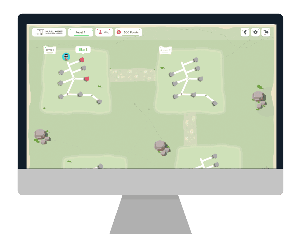
Seeing blurry future levels confuses new users. They can't tell how much they can learn, get discouraged by the hidden path, and struggle to plan their progress. This makes the whole experience feel overwhelming and unclear.
Old Product
Old Product
2.
Even if we fix the number of levels shown now, the design might struggle if we add more levels later. It could become too crowded and confusing for users to navigate.
Old Product
Old Product
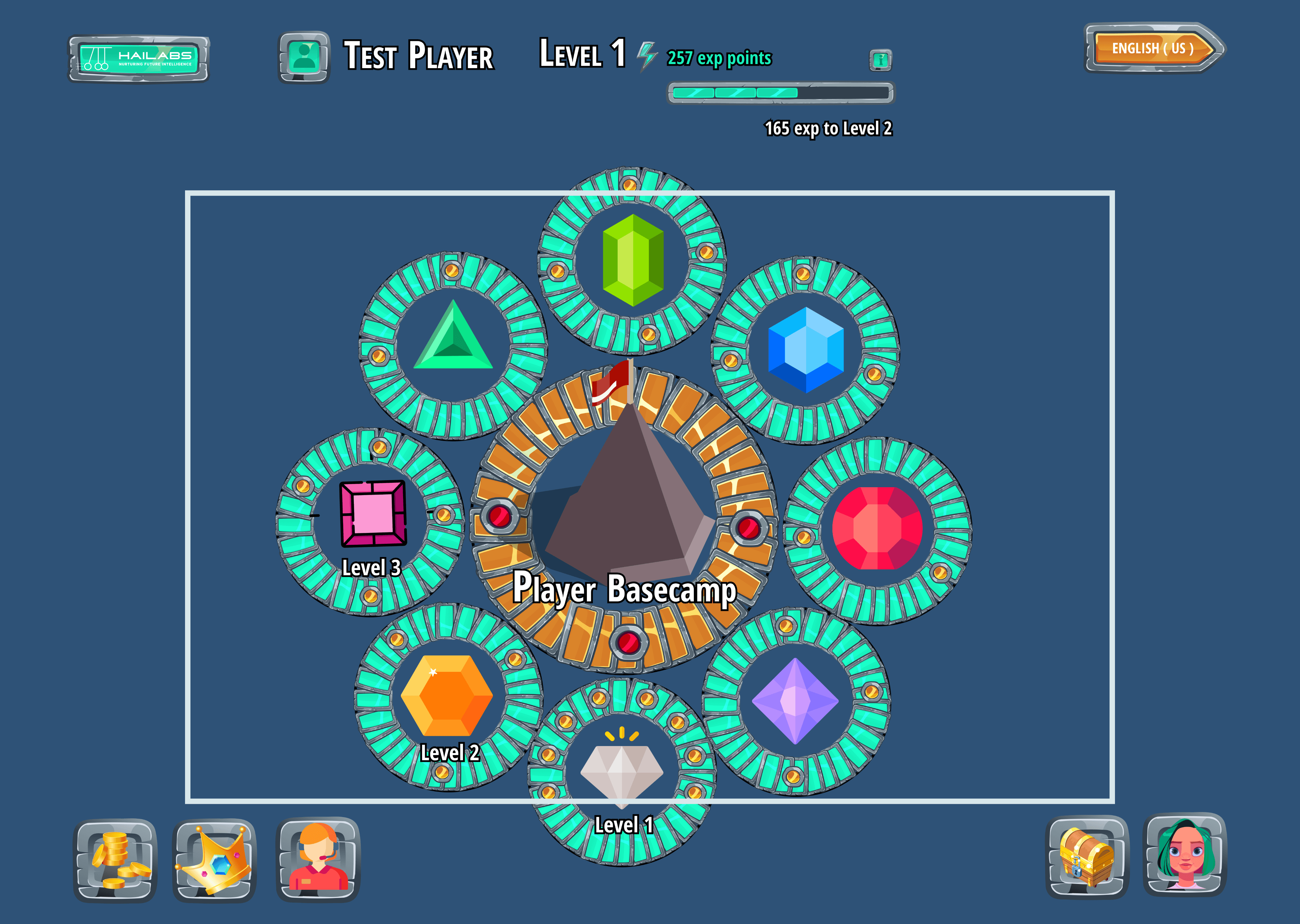
3.
It's still not apparent from the level icons whether they represent clickable elements or not. This lack of affordance makes it unclear to users how to interact with the levels to access the learning modules
Old Product
Old Product
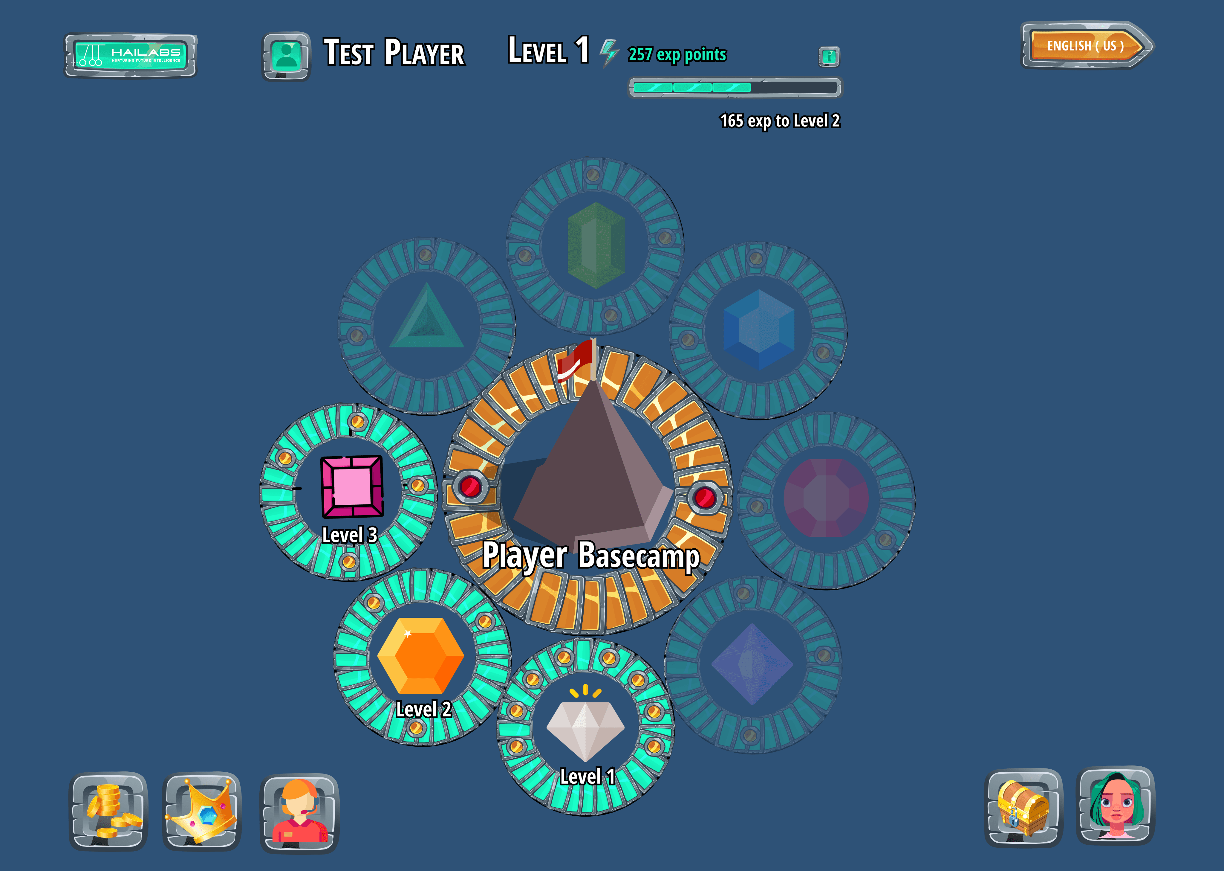
4.
The current design is visually unappealing and might feel outdated to kids. This lack of vibrancy creates a dull learning experience that disengages young users.
Old Product
Old Product
Redesign Goals
Make it simple,fun and Empowering
As a designer, my primary goal was to transform the experience of learning data science and machine learning from a tedious task into an exciting adventure. Kids often perceive STEM subjects as dry and complex, so my challenge was to inject fun and engagement into the learning process. Before diving into the visual design, I focused on key elements to ensure a seamless and rewarding experience for young learners:

Intuitive Navigation: A clear and simple user flow guides kids through complex concepts without confusion or frustration.
Intuitive Navigation: A clear and simple user flow guides kids through complex concepts without confusion or frustration.

Playful Interactions: Interactive elements make learning a hands-on experience, fostering a sense of discovery.
Playful Interactions: Interactive elements make learning a hands-on experience, fostering a sense of discovery.
Rewarding Progress: A built-in reward system provides a sense of accomplishment and motivates continued learning.
Rewarding Progress: A built-in reward system provides a sense of accomplishment and motivates continued learning.
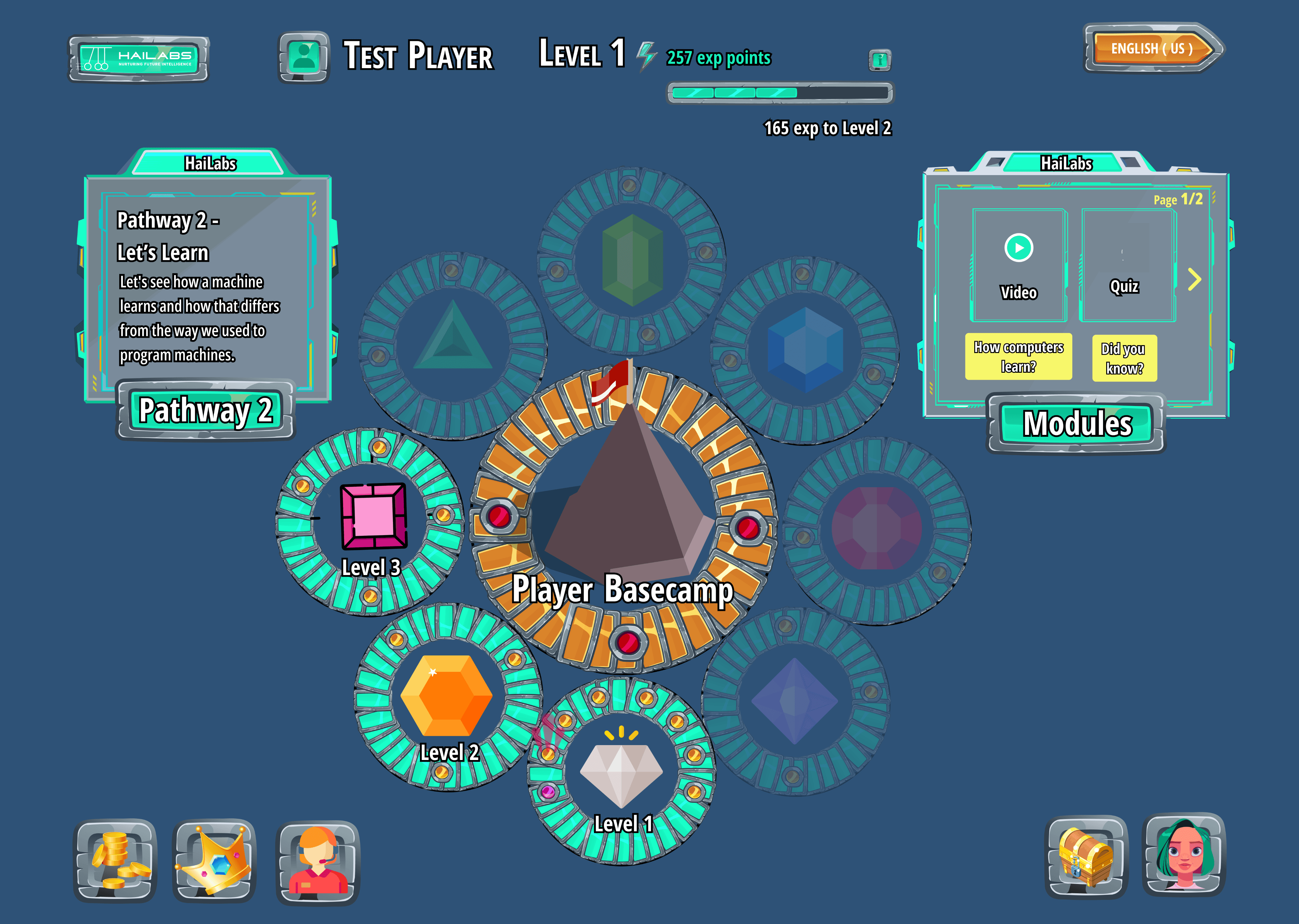
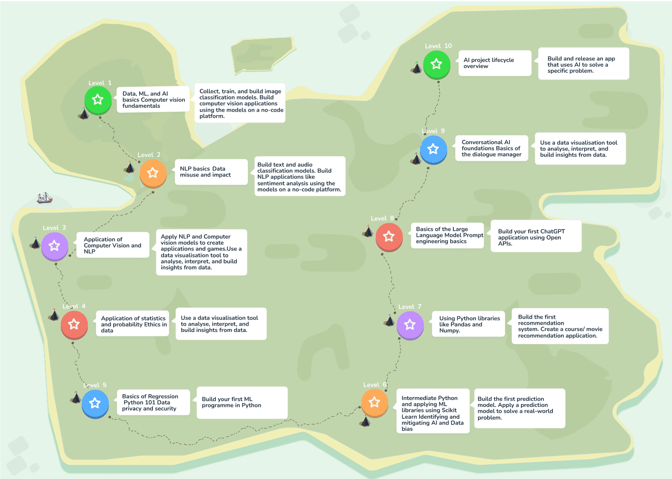
1#
.Implemented a clear level progression system with visual cues and interactive elements to guide the user and indicate progress.
.Gamified the user experience by introducing reward mechanisms like the red data houses, making the learning process more engaging and enjoyable.

After

Before

After
2#
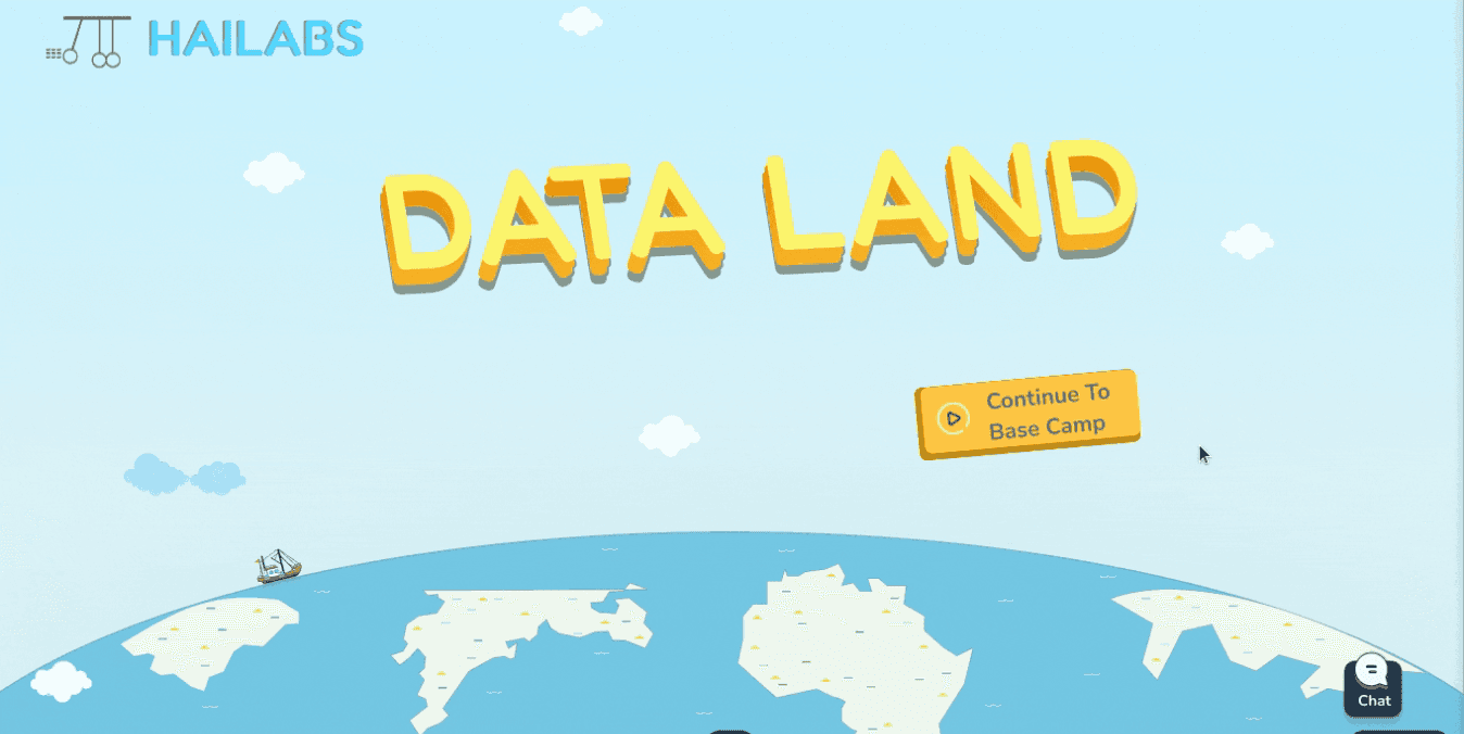
.The redesigned onboarding gives a sneak peek of the app's features and how to use them, making it easy for new users to get started.
.We turned the curriculum into a fun story set in Data Land, creating an engaging and memorable learning experience.
.This new approach has been a hit with users, getting lots of positive reviews!
After

Before

After
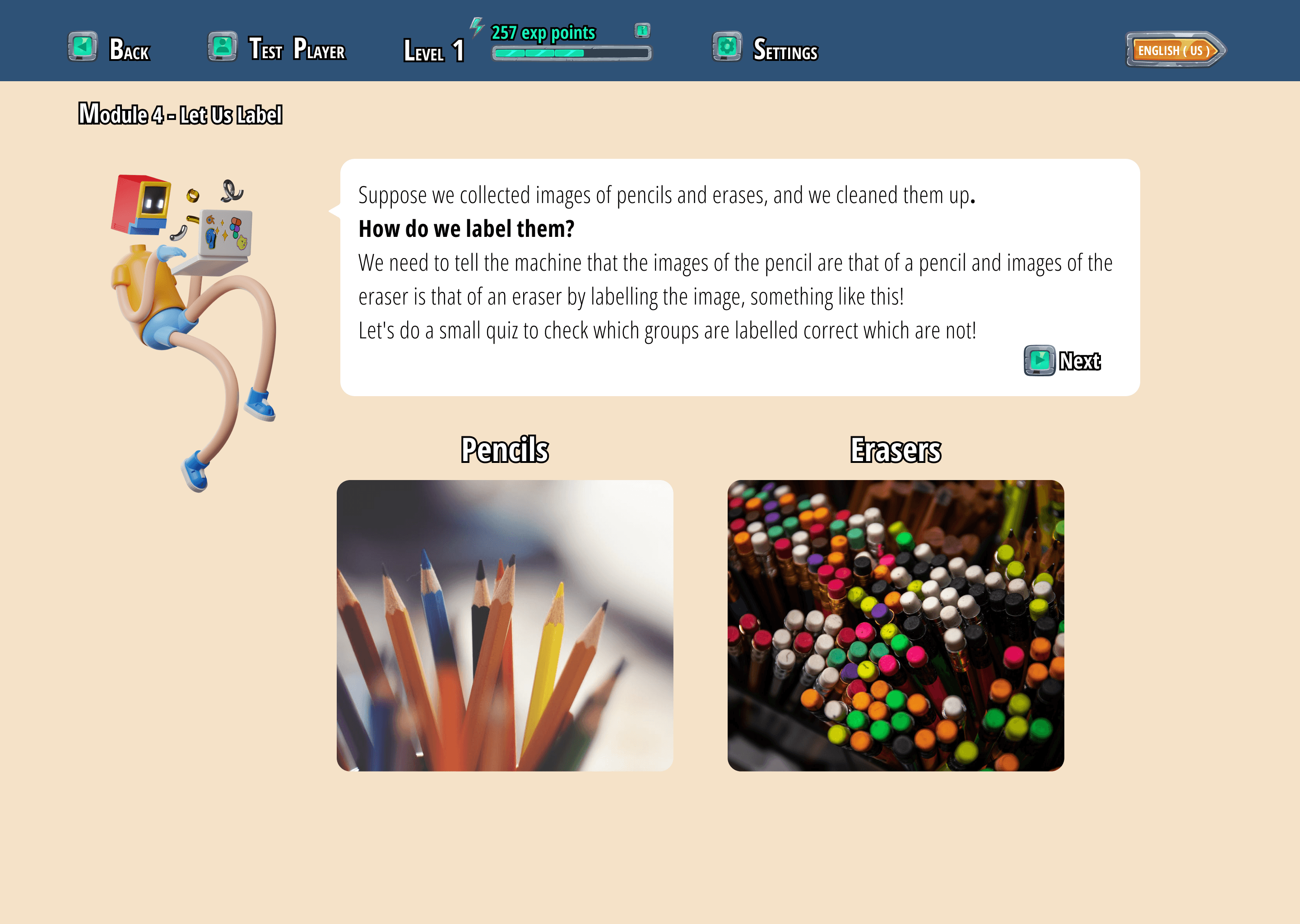
3#
.The redesigned AI model project transforms a previously complex and unclear workflow into a step-by-step guided experience using intuitive tabs.
.Significant UI improvements, combined with clear guidance, have resulted in higher completion rates among young users.
.The model training period now features interesting facts to keep kids engaged and prevent boredom during this critical stage.
.This redesigned project empowers young learners to grasp the fundamentals of AI and data structures in a fun and accessible way.

After

Before
After
4#
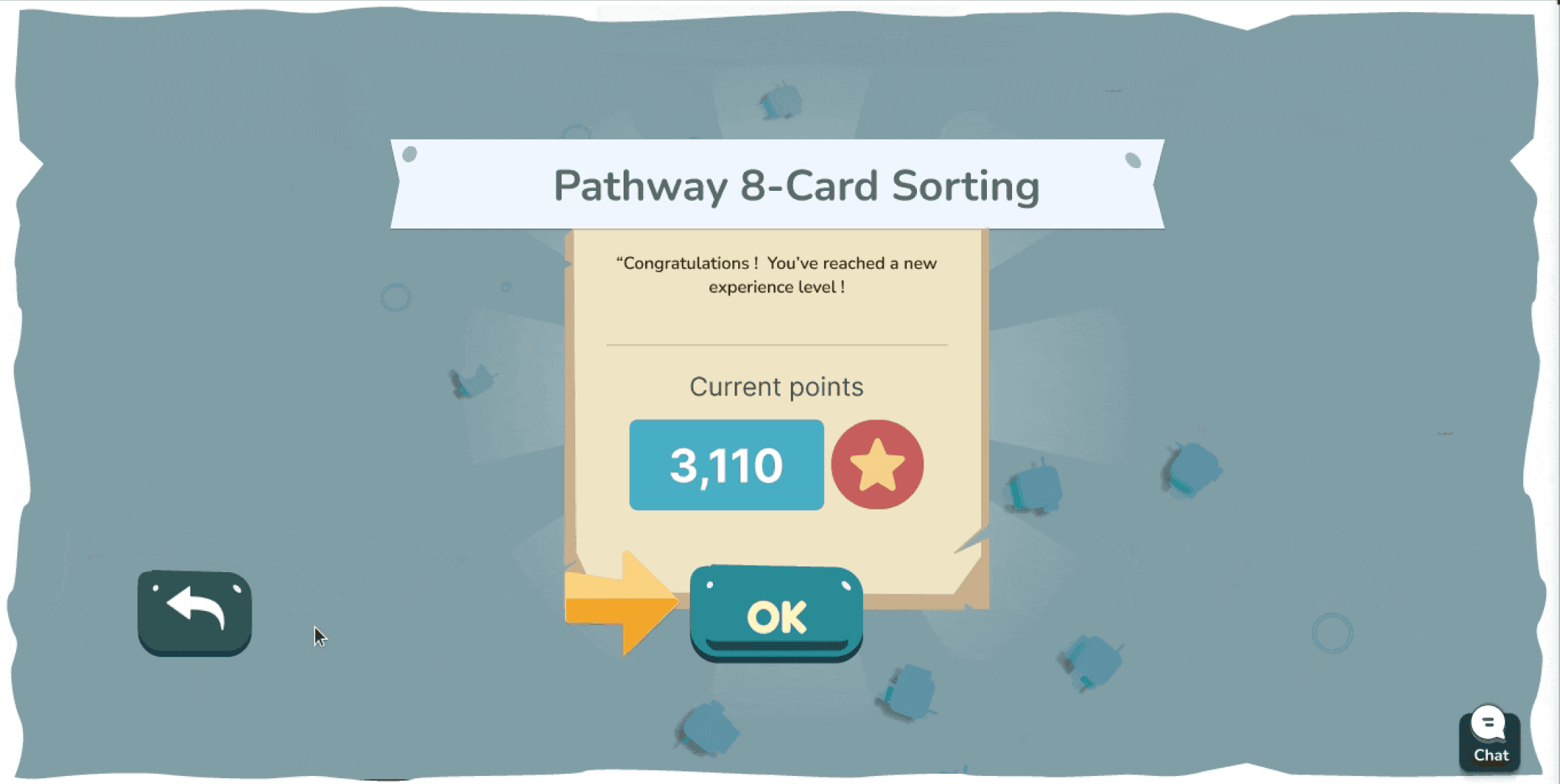
.Implemented a clear reward system with points and experience levels, displayed prominently on the success screen after each module and pathway.
.This positive reinforcement encourages users to continue their learning journey and strive for higher achievements.
After

Before

After
5#
.Clear visual cues (green for correct, red for incorrect) provide instant feedback, reinforcing learning.
.Concise explanations accompany each answer, helping users understand the reasoning behind correct and incorrect choices
.The "Continue" button is strategically placed next to the feedback and hints, guiding users through the learning process.

After

Before
After
6#
.Implemented a clear reward system with points and experience levels, displayed prominently on the success screen after each module and pathway.
.This positive reinforcement encourages users to continue their learning journey and strive for higher achievements.

After

Before

After
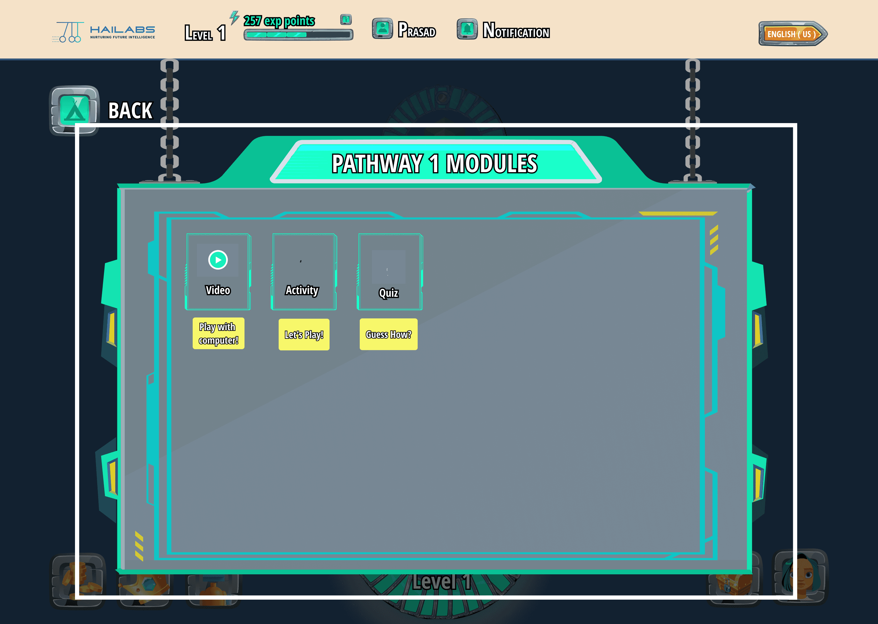
New Features & Design Enhancements
I designed and implemented new features to expand the platform's capabilities and further enhance the learning experience for young users.

New Designs

New Designs
New Designs
Number Impact
The redesigned web app saw a remarkable 1050% increase in user engagement, jumping from 40 users to 460, and received overwhelmingly positive feedback from young learners and educators alike.
Challenges and Learning
Fixing a Confusing Mess: The app was hard for kids to use. I made it easier by organizing things better and using brighter colors.
Too Much Stuff, Too Hard to Find: There was so much to learn, it was overwhelming! I grouped similar things and made it easier to find the right lessons.
Colorful Chaos: I added fun colors to each type of activity, but it became hard to keep track of. Now I know to be careful when using lots of colors.
Learning About Kids: I didn't know much about how kids learn, so it was tricky to make things fun for them. Talking to experts helped a lot!
Keeping Up with Changes: We worked fast and changed things a lot based on what users said. I learned to adapt quickly and make sure the app always worked well.
See my other projects
India
Present
Courtbook

Ui/UX Designer
#Legal-tech
2024
PRODUCT
Case Study
India
upcoming
Hive

Product Designer
#News-community
2024
PRODUCT
Samsung Galaxy F22 launched in India.

Createblog.com-jammy epic
Follow

Home
Saved
Events
Jobs
9:41
Transactions
9:41
Stay Updated with Tech Trends
Get the latest blogs, news, and updates on emerging technologies right at your fingertips.

Sign up for free
Sign up for free
Already signed up? Log in
9:41
Hive
Coming soon

aj.
അജയ്
Data Adventures for Middle Schoolers
Company
HaiLABS
Role
Product Designer
Team
1 Designer(ME), 5 SDE,2Q,
TimeLine
October 2022-november 2023 (1yr)
Started in 2019, HAILabs.ai is an edtech platform that engages children and teenagers in AI and data science through interactive activities, personalized content, an AI tutor, and gamified learning, fostering self-paced education in these advanced fields.
Background
Joined Hailabs in Oct 2022 amid user dissatisfaction due to poor UI/UX. Tasked with overhauling the platform to address negative feedback, improve user experiences, and positively transform the platform's appeal and functionality.
My Responsibilities
Led Hailabs' web app redesign for young learners, enhancing UI/UX. Achieved recognition from Stanford and won awards, showcasing commitment to top-tier design. Collaborated with team leaders to align the new design with company objectives and user satisfaction.
Challenges
Business Problems
No brand awareness
Low student engagement
Lack of parental interest
Poor engagement with schools and institutions
No conversions or sign-ups
Perceived as just another edtech platform
Design Problems
Aesthetics not appealing
Difficulty in use for different age groups
Lack of a structured design process
Insufficient research in design development
Outcome And Achievments
Increased Engagement
Improved Visibility
Improved overall User Experince
Number Impact
Increase in users :460
Percentage increase : 1150%
Understanding The Problem Space
The initial version of web app, while well-intentioned, struggled to maintain user engagement over time. User feedback pointed to several sources of friction that hindered an optimal learning experience. These included:
Confusing Navigation
Kids often felt lost or overwhelmed by unclear pathways within the app, leading to frustration and abandonment.
UI Overload
The interface was cluttered, distracting kids from the core learning content and making it difficult to understand where to focus.
Text-Heavy Design
The reliance on blocks of text made the web app feel overwhelming and less approachable for young learners.
Lack of Excitement
Kids found the experience boring with no engaging elements to keep them motivated.
User Pain Points
Upon joining the team, I thoroughly analyzed the results of prior user testing. This data revealed critical pain points that were hindering the learning experience and causing user drop-offs. My focus shifted to translating these findings into actionable design solutions.These are some of the prominent pain points that led to user drop-offs.
1.
Seeing blurry future levels confuses new users. They can't tell how much they can learn, get discouraged by the hidden path, and struggle to plan their progress. This makes the whole experience feel overwhelming and unclear.
Old Product
Old Product
2.
Even if we fix the number of levels shown now, the design might struggle if we add more levels later. It could become too crowded and confusing for users to navigate.
Old Product
Old Product
3.
It's still not apparent from the level icons whether they represent clickable elements or not. This lack of affordance makes it unclear to users how to interact with the levels to access the learning modules
Old Product
Old Product
4.
The current design is visually unappealing and might feel outdated to kids. This lack of vibrancy creates a dull learning experience that disengages young users.
Old Product
Old Product
Redesign Goals
Make it simple, Fun and Empowering
As a designer, my primary goal was to transform the experience of learning data science and machine learning from a tedious task into an exciting adventure. Kids often perceive STEM subjects as dry and complex, so my challenge was to inject fun and engagement into the learning process. Before diving into the visual design, I focused on key elements to ensure a seamless and rewarding experience for young learners:

Intuitive Navigation: A clear and simple user flow guides kids through complex concepts without confusion or frustration.
Playful Interactions: Interactive elements make learning a hands-on experience, fostering a sense of discovery.
Rewarding Progress: A built-in reward system provides a sense of accomplishment and motivates continued learning.
Final Shipped Design
New Designs
#1
Implemented a clear level progression system with visual cues and interactive elements to guide the user and indicate progress.
Gamified the user experience by introducing reward mechanisms like the red data houses, making the learning process more engaging and enjoyable.
Before
After
New Designs
#3
The redesigned AI model project transforms a previously complex and unclear workflow into a step-by-step guided experience using intuitive tabs.
Significant UI improvements, combined with clear guidance, have resulted in higher completion rates among young users.
The model training period now features interesting facts to keep kids engaged and prevent boredom during this critical stage.
This redesigned project empowers young learners to grasp the fundamentals of AI and data structures in a fun and accessible way.
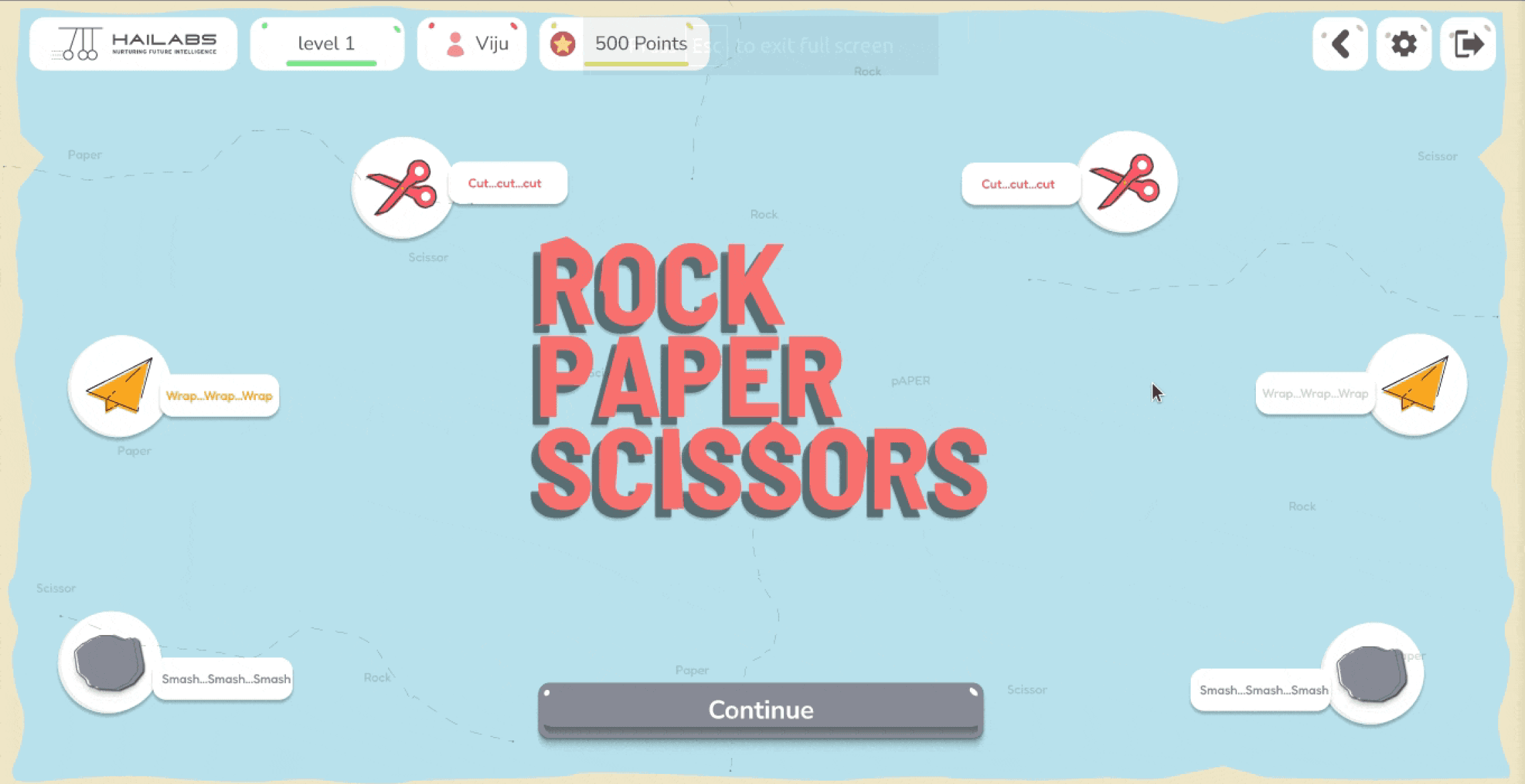
New Designs
#4
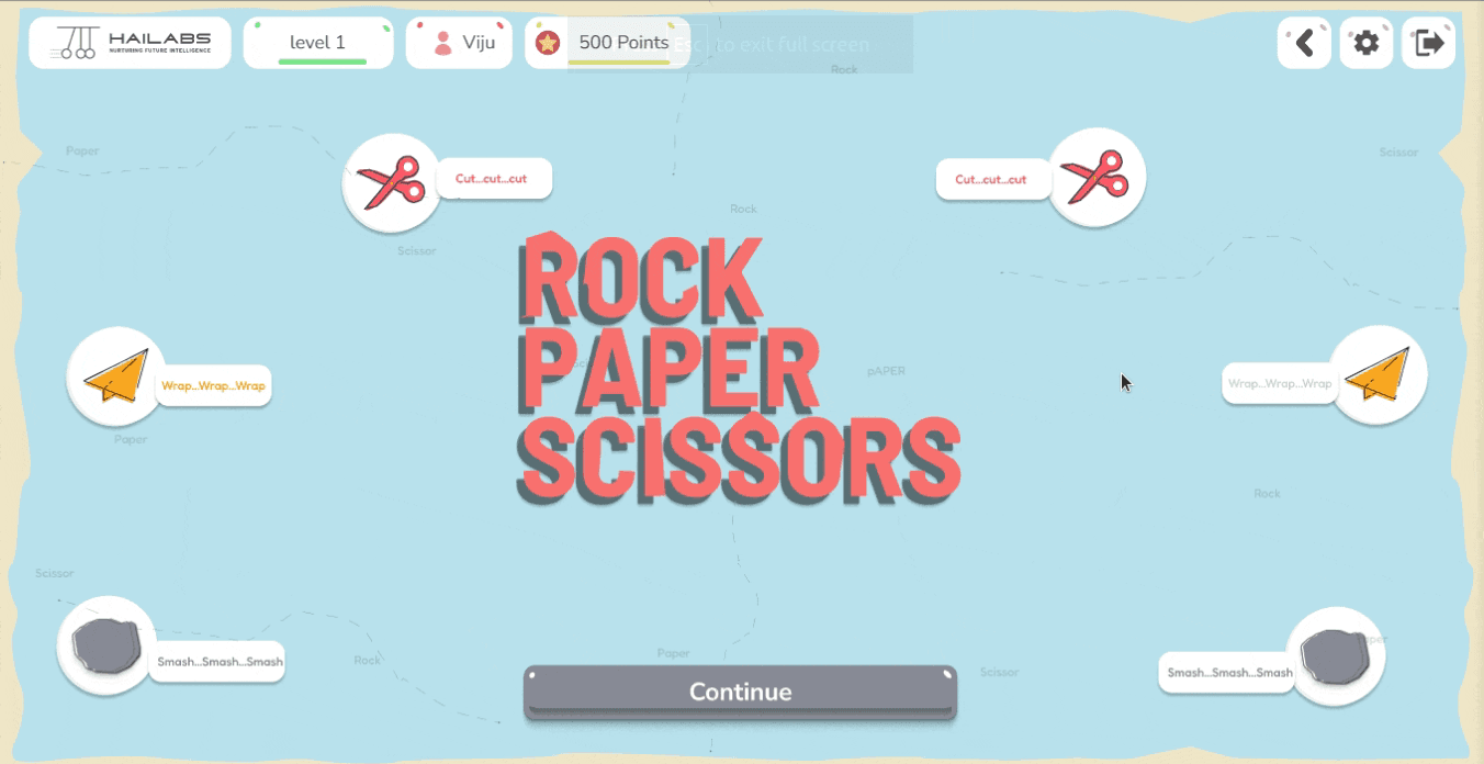
Simplified the Rock Paper Scissors game, making it more intuitive and enjoyable for kids.
Enhanced user experience with clear calls to action, reducing confusion and frustration

New Designs
#5
Clear visual cues (green for correct, red for incorrect) provide instant feedback, reinforcing learning.
Concise explanations accompany each answer, helping users understand the reasoning behind correct and incorrect choices
The "Continue" button is strategically placed next to the feedback and hints, guiding users through the learning process.

New Designs
#6
Implemented a clear reward system with points and experience levels, displayed prominently on the success screen after each module and pathway.
This positive reinforcement encourages users to continue their learning journey and strive for higher achievements.
Before
After
New Features & Design Enhancements
I designed and implemented new features to expand the platform's capabilities and further enhance the learning experience for young users.
New Designs
New Designs

New Designs
Number Impact
The redesigned web app saw a remarkable 1050% increase in user engagement, jumping from 40 users to 460, and received overwhelmingly positive feedback from young learners and educators alike.
Challenges and Learnings
Fixing a Confusing Mess: The app was hard for kids to use. I made it easier by organizing things better and using brighter colors.
Too Much Stuff, Too Hard to Find: There was so much to learn, it was overwhelming! I grouped similar things and made it easier to find the right lessons.
Colorful Chaos: I added fun colors to each type of activity, but it became hard to keep track of. Now I know to be careful when using lots of colors.
Learning About Kids: I didn't know much about how kids learn, so it was tricky to make things fun for them. Talking to experts helped a lot!
Keeping Up with Changes: We worked fast and changed things a lot based on what users said. I learned to adapt quickly and make sure the app always worked well.
See my other Projects
2024
PRODUCT

Courtbook
An API-first platform that allows users to access and integrate court data from both federal and state courts.
2024
PRODUCT
Samsung Galaxy F22 launched in India.

Createblog.com-jammy epic
Follow

Home
Saved
Events
Jobs
9:41
Transactions
9:41
Stay Updated with Tech Trends
Get the latest blogs, news, and updates on emerging technologies right at your fingertips.

Sign up for free
Already signed up? Log in
9:41
Hive
Hive
Hive help developers to stay on top of the latest data science trends, find exciting career opportunities, and connect with a vibrant community